Crate & Barrel At Home

The Challenge
As a leader in home decorating retailing, Crate & Barrel has decided to expand its services to include additional planning and buying options for its customers. Consumers cited that they found it difficult and overly time consuming to decorate their homes that replicate styles they had seen elsewhere. Others felt they needed more advice about how to decorate within a budget. This is where Crate & Barrel At Home comes in, making it easier for people to find inspiring room design ideas and create “the look” they’re interested in in their own home. The site I designed will make it easier for customers plan and purchase items they need to recreate their favorite looks and keep within their budget.

The Process
Research
What's out there already and what is everyone else doing? As the leader in home decorating, first we must take a look at what Crate & Barrel is doing well and how they can improve.
Competitive Analysis
I started off with Competitive Analysis, taking a few of Create & Barrel’s top competitors to see what they have to offer to their customers. This research highlighted where Crate & Barrel was lacking and showed how their competitor differentiated themselves.
Crate & Barrel has a lot of features available for customers, but did not have a shop by style section. They did, however, offer users the option to shop by Rooms. This option was called “Rooms We Love”, but it was not obvious and was hard to find. Most, including Crate & Barrel, did not have a room planning option, and none of them offered an immersive experience to help with planning.

Ikea catalog - Mobile App with AR
IKEA is the main competitor that provides an immersive experience for their customers. They have two platforms; a web based 3D room planner that takes the IKEA cabinet systems and builds them out, and an app for mobile devices that features augmented reality where users can see IKEA furniture in their actual homes. The user reviews and feedback for the AR app were not favorable for IKEA.
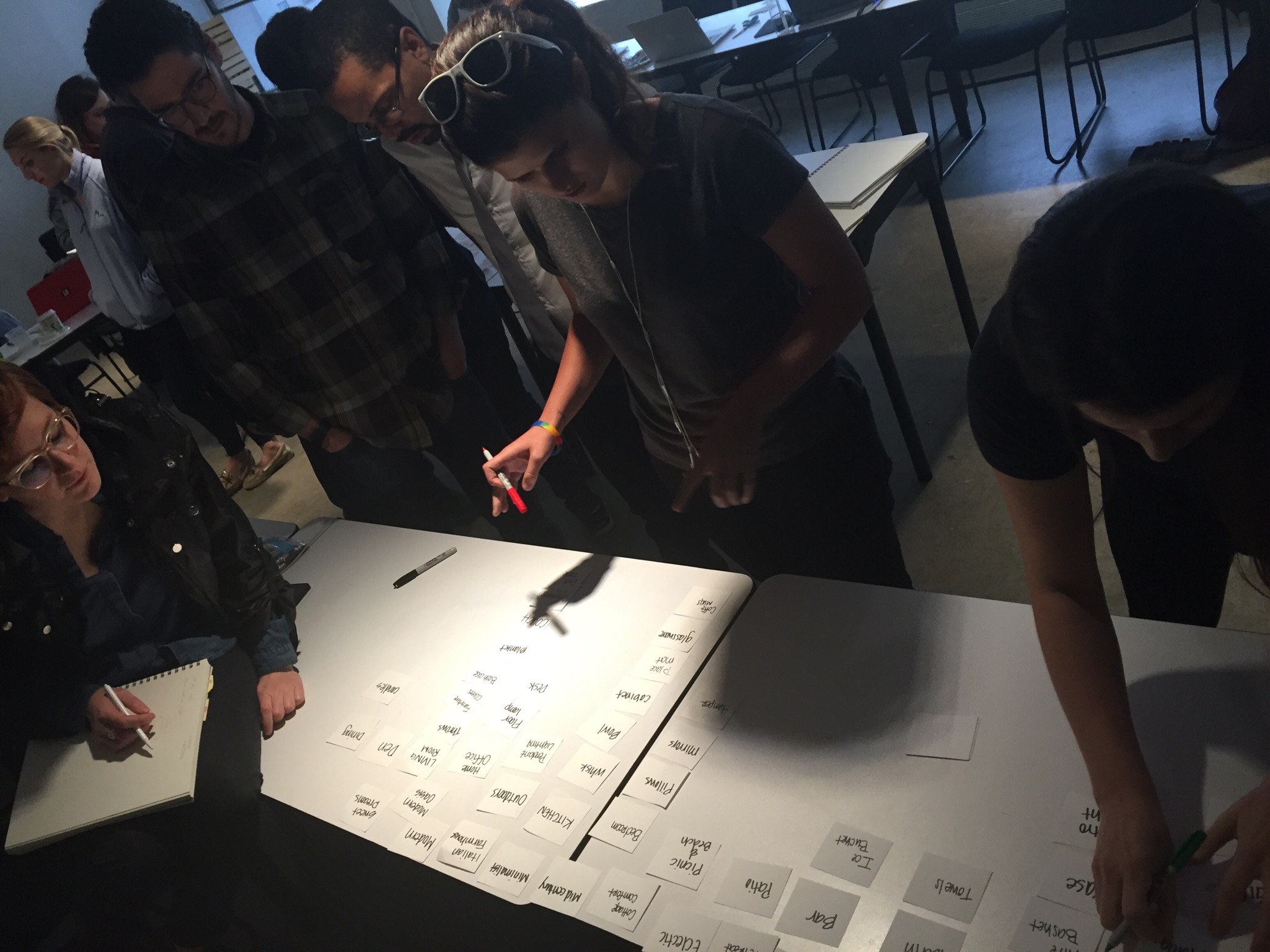
Card Sort
With our competitors in mind, we used Card Sorting to see how users would group the items. Card sorting helped see into our customers' minds, and showed us why they would group things in certain categories. It was useful to be able to have an open dialogue and allowed them to have some transparency. Most users found it hard to differentiate Style vs. Rooms and interchanged what went into those categories. This was key in order to figure out what the Global Navigation would look like, and what would be categorized under it. After a few tries and card sorts, it was clear how the Global and Local Navigation would be laid out.

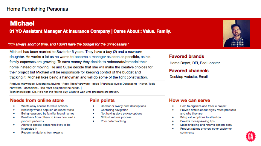
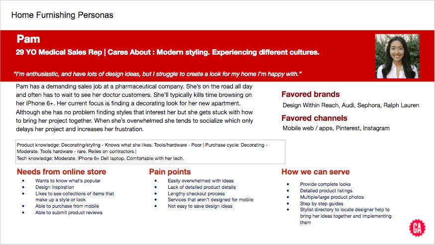
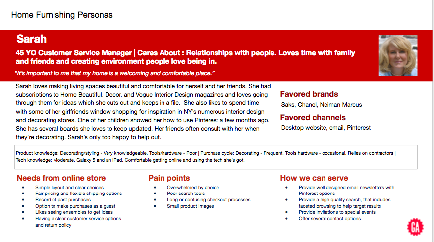
Personas
Personas were given as part of the brief and it was our job to keep them in mind. They were a key aspect in developing a user flow. The personas were different in some aspects but pain points were all similar; they wanted to keep their projects organized, have their designs streamlined so there weren’t too many choices to choose from, have clear photos and descriptions of the items, an easy check out, an easy way to save and share their designs and projects, all while keeping their budget in mind.
Design, Test, Iterate
Sitemap
The data I received from the card sort, was that users tended to group things in three different ways; type of room, the style and aesthetic they thought went together, and made categories for the curated room collections that existed already (Rooms We Love). This helped define the Global Navigation.
The Local Navigation is dedicated to Crate & Barrel At Home’s unique features that contain their Projects and Idea Boards. The Idea Boards tab is a good starting place for any user who wants to get inspired and play around with their ideas.
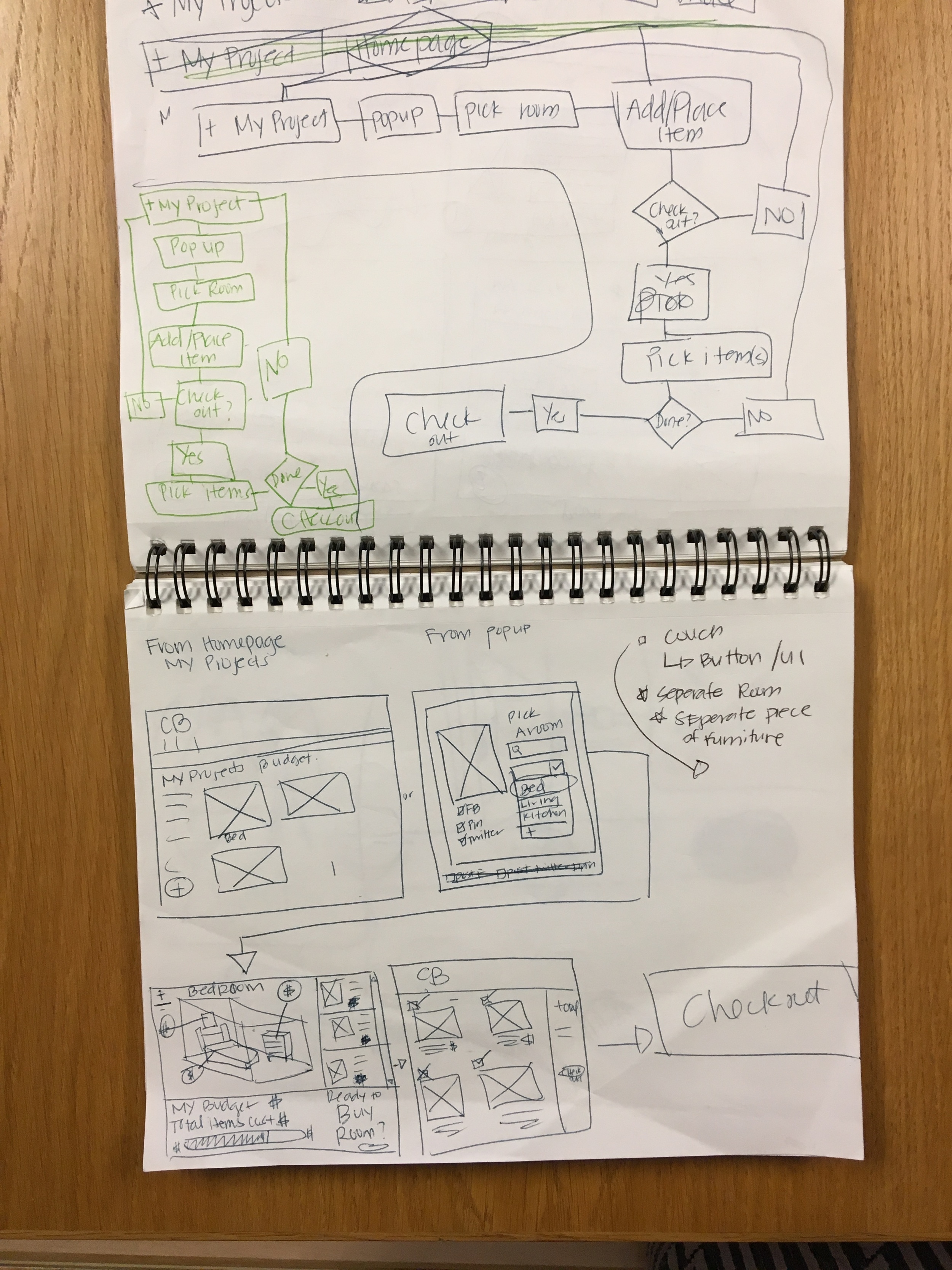
User Flow
After getting to know the personas and their pain points, creating a user flow that helped all of them was the best solution. Shopping via the Rooms We Love category was the most efficient way to find items to add to their projects and test out in their rooms. This would lead to finding the best designs and purchasing a whole room.
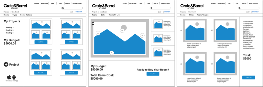
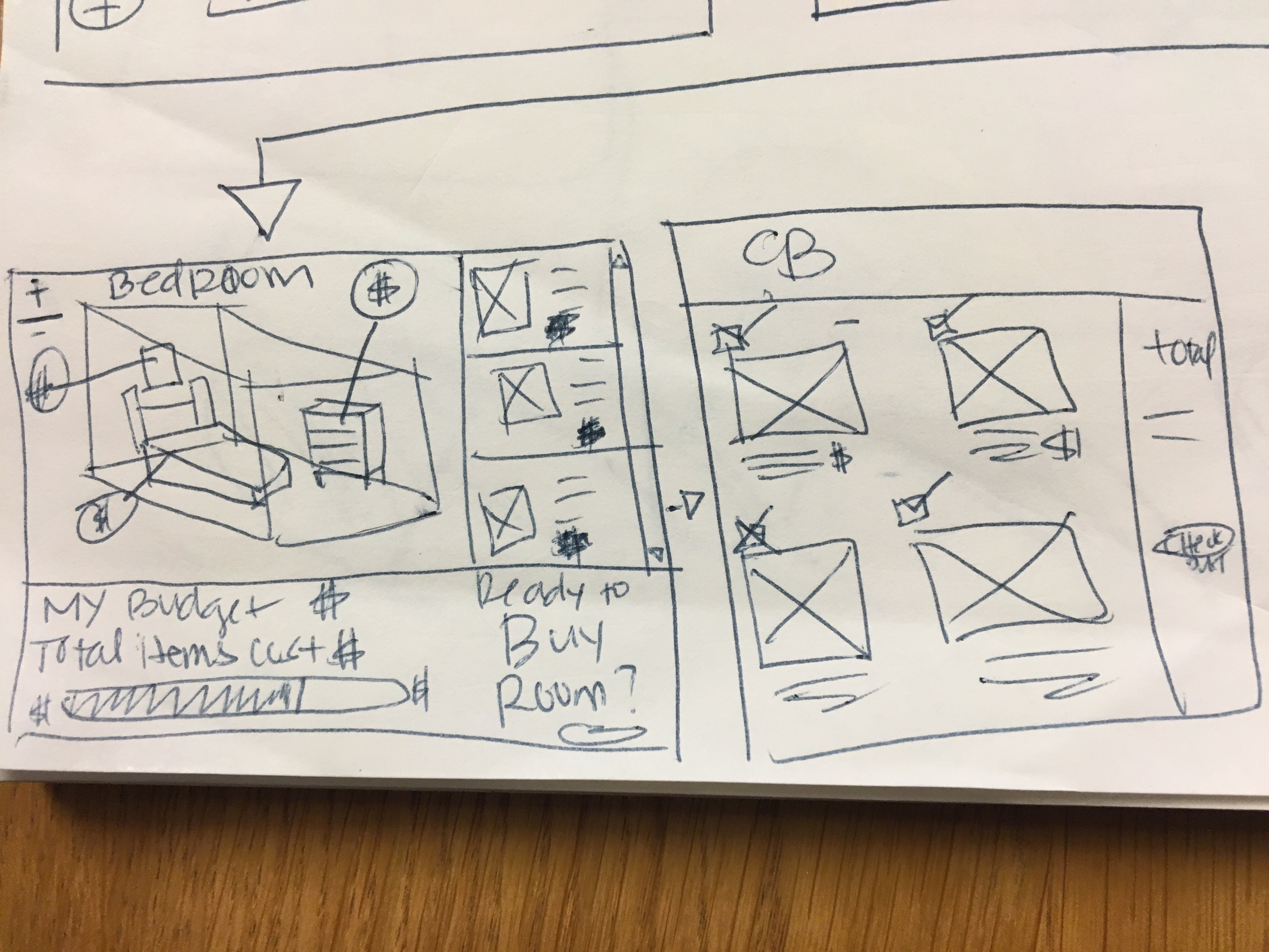
Wireframe
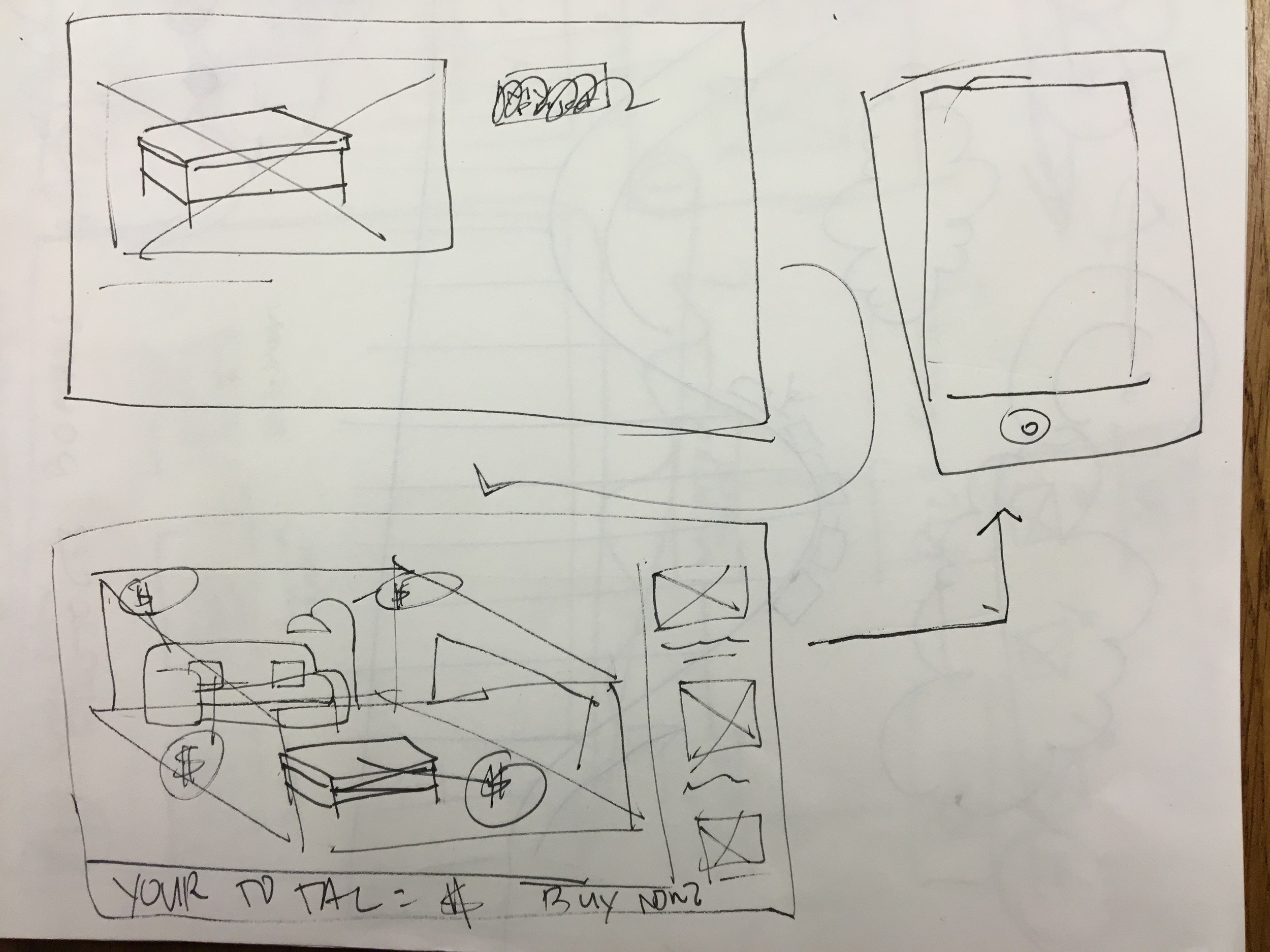
I drew a few iterations of what I thought the My Project process would look like and how the 3D experience should look. Figuring out the flow and how users would go from decorating their room, to selecting items they want, to actually purchasing those items was tough at first. I wanted the experience to be fun but also useful and profitable for Crate & Barrel at Home.
Test & Iterate
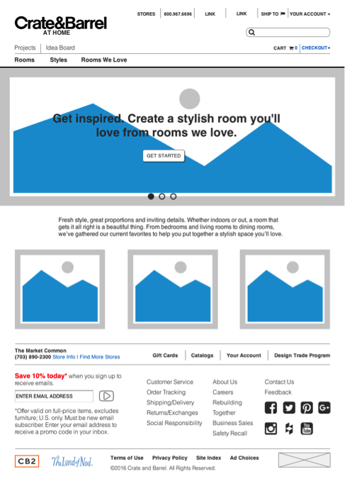
I tested a number of users and read from the same script, giving them a scenario which had an end goal. I told them they had to shop for a Sconce in the Natural Modern style in their favorite “Rooms We Love” collection. Then they had to “pin” it to their Projects (in this case bedroom), play with the 3D Immersive Experience room, and pick items to buy and then walk through check out process. At the very beginning we ran into some snags. The first iteration had a tag line with two CTA buttons that said, “Get Started” and “Sign In”. Users automatically wanted to click there first.
This was one of many things I iterated on after receiving the user feedback. I changed the home page hero image to read "Get inspired. Create a stylish room you'll love from the rooms we love." with a CTA button that read "Get Started". This version tested much better for this particular flow, there was no confusion as to where the user would go when given the scenario I was testing.
Prototype
Here's a video of the Crate & Barrel At Home prototype which takes you through finding an item, adding it to your projects, and checking out.
You can also click through the Crate & Barrel at Home e-commerce site via Axure RP.

Future Forward and Takeaways
A few more things I discovered after testing the final prototype were:
· Users expected to sign in, in order to get their projects
· Users wanted an easier way to get to the Rooms We Love page (other than the drop down)
· Users felt that there needed to be a more seamless transition when going from the 3D Room Planner to picking their items they wanted to purchase.
With these takeaways I was able to update the prototype include a user sign-in to the flow. This ensured that there was no confusion when trying to locate their projects. Again, after testing the new hero image, users were able to get to the Rooms We Love page with just one click, instead of clicking the drop down and selecting from nav.